Get Inspired
Redecorating and COLOR: 24 Things You Should Know
COLOR decisions can be one of the most exciting but also polarizing and nerve racking decisions. I like to break down these decisions into 3 major categories with a few helpful tips to ease the pain and enjoy the gain:
COLOR can enhance the good architectural features and/or camouflage the bad ones.
- If you are moving into a new home or apartment or you’re redecorating an existing one, the first step is establishing a good floor plan for each room before you start picking a new color scheme and new furniture.
- If you are planning to use what you already own, you are ahead of the game in terms of some color decisions.
- It will be important to evaluate the empty space as to its natural and artificial lighting because lighting affects color schemes as well as furniture layouts.
- The shape of the rooms and size will also help provide some additional parameters for how to use color in a specific room. Of course, the architectural features also influence how to use paint. Using the right color paint on the walls can change the appearance of the shape of a room. You can shorten the visual impact of a long narrow room by painting the back wall, furthest from you, a darker shade of the same color used on the adjacent side walls.
- Before making any final color decisions, look at the paint chips in the specific room receiving each specific color. Check the color swatch, or better yet paint a small test on the wall of the room in the darkest and brightest colors of the room. Look at the test colors in both daylight as well as night light. When dry, select the color based on the majority of time you will spend in the room.
- Rooms used at night like bedrooms, living and dining rooms usually can handle moodier, darker and quiet colors.
- Kitchens, play, and study rooms including home offices usually need either more neutral or brighter and lighter, more gregarious and active colors.
- Painting all wood trim in a small room the same color as the walls will make the space feel larger and less broken up.
- Painting the doors the same color as the walls will further visually enlarge the room.
- If the room has a low ceiling, chair rails, and crown moldings, painting the lower wall section below the rail a darker shade of the same color family as above the rail, will make the room’s ceiling feel even lower because the darker the color the more your eyes will tend to be pulled downward.
- Painting a fireplace mantel the same color as all of the wood trim in the room will unify the look of the fireplace making it feel more part of the structure of the home and giving the room a larger feeling.

- If the room is large with walls broken up with a lot of windows and doors, paint all four walls with one color and use either white or no trim color.
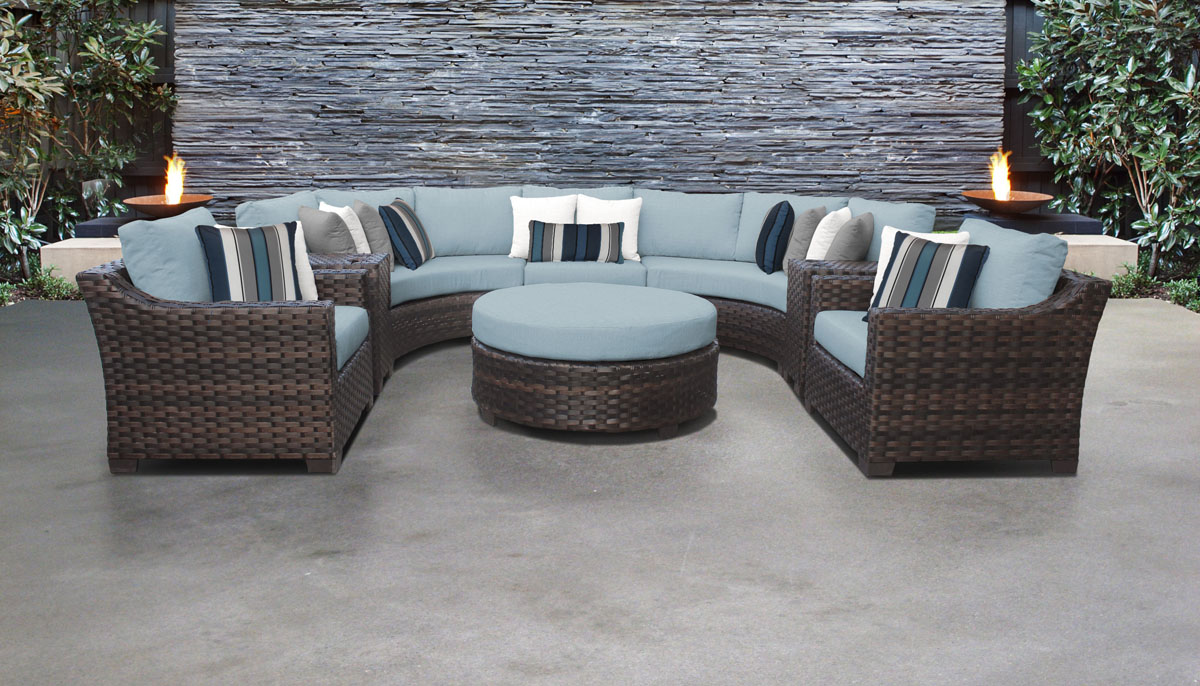
COLOR can be used to create a specific mood and is easy and fun.
- Dark walls will provide a sultry, romantic feeling while the bright primary colors will create excitement and a modern edge.

- Light and bright colors – especially primary – tend to be best for confident, extroverted personalities.
- You can establish a color scheme from many inspirations starting with the favorite colors you like to wear or a very favorite piece of art.
- If you are a collector of graphic art or paintings, select your favorite, largest piece for the inspiration for your color scheme and select 1 or 2 major colors from the graphic to be used for the painted accent wall(s).
COLOR can create a quick fix for tired rooms
- Nothing can change the look of a room as easy and fast as a fresh coat of paint in a new color.
- If all the furniture is staying put, perhaps you can get a fresh new look with a new area rug and pillows and paint. Select these first and then choose a color from the rug or pillows. Next, select a paint strip and pick one of the shades of a color found as the dominant color in the pillows.
- It’s always good idea to build a color scheme in the beginning of a new decorating project in one of these three basic color groupings:
- A Monochromatic scheme is based on various shades of the same color family using variations of the same color from light to dark plus some additional related colors that may sit adjacent to the key color. This can create a room of
- Complementary color schemes – Using two colors that sit opposite each other on the color wheel tends to be a bolder, more confident scheme great for extroverts. These color combos are red opposite green (and all their individual neighboring shades of the same color), blue opposite orange, and purple opposite yellow.
- Neutral Colors typically are void (or almost void) of color and can range from various shades of pale – almost white that has a touch of a specific color tinting the white – to a very dark shade, almost black variation of the same color. This is referred to as a Quiet color scheme.
- Often a neutral color scheme is inspired by natural materials with many variations of the specific color as it begins to fade becoming very light fading towards white or very dark leaning inward towards black.
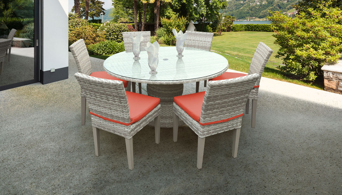
- Coordinated accessories can play a major role in developing and completing your color scheme if used judiciously. However, accent colors used on furniture and accessories is like using condiments when cooking. Without it, the room can be bland and void of personality but too much can ruin the effect.
- Pick an accent color you love and use it on a painted accessory or within a dominant fabric or rug in the room, as the catalyst for an entire color scheme.
- This accent when combined in a rug, pillows, or accent fabric on a chair becomes the perfect punctuation within the room. Repeating that specific color again on an accent wall provides a deliberate statement but be careful not to overdo it by matching up the color with too many, smaller insignificant accessory pieces.
- “Less is More” means just that – use only a few statement pieces of colorful art objects that clearly add beauty, the right color tie-in and scale. It’s not how many but how special the accessories are within the room that will finish a room with just the right pop of color.

By Jena Hall